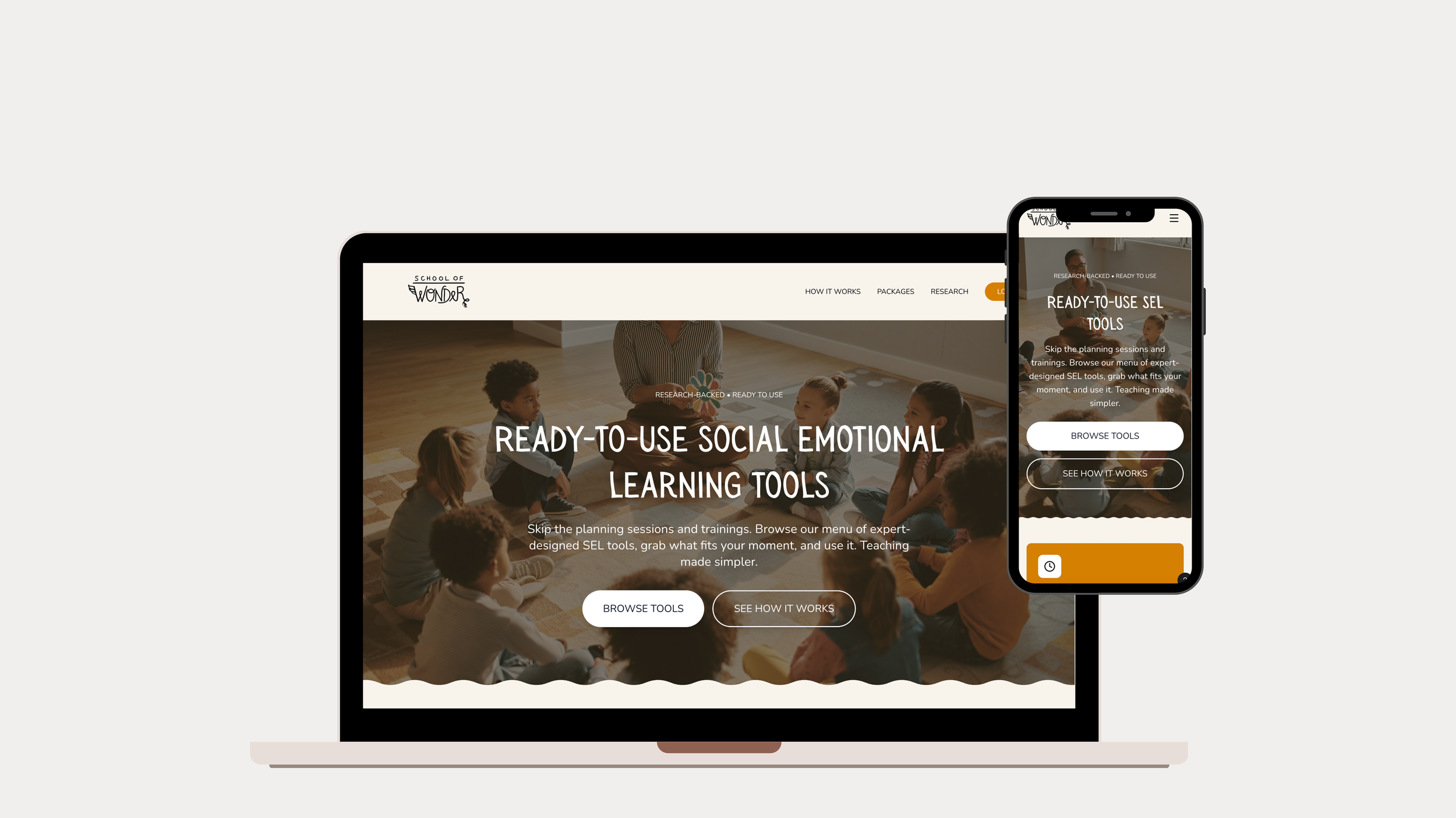
Making Social Emotional Learning Desirable
This project brought a digitized Social-Emotional-Learning Curriculum to educators in the form of modular and flexible tools that could be easily integrated into existing workflows.
The User Problem
With the rise of Social-Emotional Learning (SEL) initiatives throughout the education system, educators feel overwhelmed with the time and work involved in teaching this content, due to lack of time and budget constraints. They need modular, flexible tools they can easily implement into their day-to-day workflow.
The Solution
What educators need was not another program.
We reframed School of Wonder’s curriculum to emphasize low time investment, breaking it into modular tools designed to support educators within their existing curricula rather than requiring adoption of entire lessons.
My Role
Digitally package a curriculum and design a dedicated web page
Lead user research
Conduct competitive analysis to inform product positioning
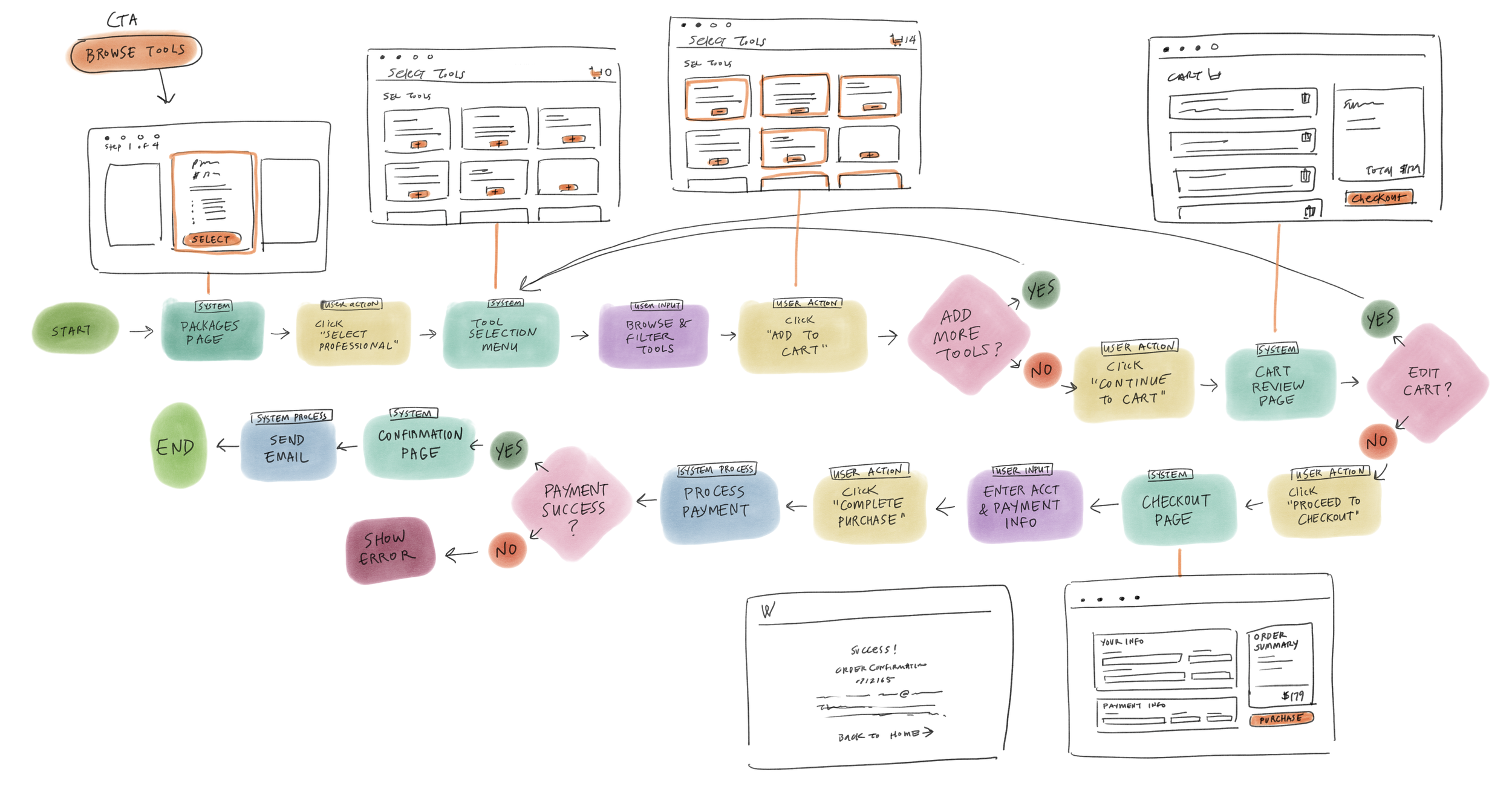
Create user flows to map navigation and decision-making
Design wireframes for the web page
Conduct usability testing to identify points of friction and iterate
The Business Problem
Although the School of Wonder had a pedagogically strong program that appealed to school decision-makers, it was framed as a full curriculum that teachers didn’t have the capacity to adopt. This created a gap between purchase intent and real-world usage. Without addressing these user needs, the product risked low adoption, which would directly impact revenue.
Design Process
-
Quantitative and qualitative interviews with 12 educators from diverse backgrounds
Affinity mapping to clarify user motivations and pain points
-
Determined pain points in current site map
Restructured site map to reflect solutions to pain points
-
Low/Mid/High fidelity wireframes for desktop and mobile
Iterating based on feedback
Prototypes
-
Conducted usability tests with 7 participants
Mapped out pain points
Iterated on areas based on user feedback
-
Worked with product team to create branding concepts based on company values and stories
Produced full design system with component library
Created hand drawn illustrations used throughout the website


Competitive Analysis
From the outset, three groups were invested in the success of this product, each with varying expectations.
Stakeholders wanted a high-level, marketable product—something polished and rigorous that could be sold to school principals and decision-makers.
The client, who authored the curriculum, wanted it digitized without compromising its creative integrity or original vision.
Users (educators), however, revealed a very different reality during interviews. They were not looking to adopt an entirely new curriculum into their already packed schedules. Instead, they wanted flexible, modular tools they could seamlessly integrate into the curricula they were already required to teach.
This disconnect created tension for the project—how could we design something that felt lightweight and practical for teachers, while still communicating rigor, depth and impact to stakeholders?
Research Insights
We targeted and interviewed educators. These were public and private school teachers, home schooling parents, alternative program educators, afterschool directors and camp leaders. We wanted to address:
Major pain points when implementing an external program into an existing curriculum.
What educators really want and need from a Social-Emotional Learning program.
What they like from SEL programs they’ve experienced in the past.
We started interviews expecting to hear positive outlooks toward Social Emotional Learning. We actually discovered that for such an essential initiative, many educators had surprisingly indifferent attitudes toward it. Upon delving deeper, we learned that:
Adding another curriculum into their already busy workload was not readily welcomed.
Even if they found time to look through the program, there was too much training and content that they found it overwhelming.
These insights directly challenged the initial framing of the product as a “complete curriculum.” If we continued down that path, we risked building something teachers would admire—but never use.
Personas
A synthesis of interviews revealed that:
Traditional educators face time constraints, large class sizes, and the overwhelming need to multitask, leaving little time to plan or implement new materials.
Alternative educators also struggle with time constraints while also navigating limited funding and staffing capacity.


Design Advocacy
One of my biggest challenges was bringing these research findings to the broader team and advocating for a shift in how we framed the product.
I pushed for a reframing of the curriculum not as a fully-formed program, but as a menu of modular curriculum tools—short, focused components that retained the rigor of the original content while feeling approachable and usable for teachers.
This required careful balance:
Preserving the value and educational depth of the curriculum for the client
Designing for flexibility and usability for teachers
Presenting the product to stakeholders in a way that still communicated structure, rigor, and measurable impact.
Wireframes & User Flows
I created wireframes focused on two key moments:
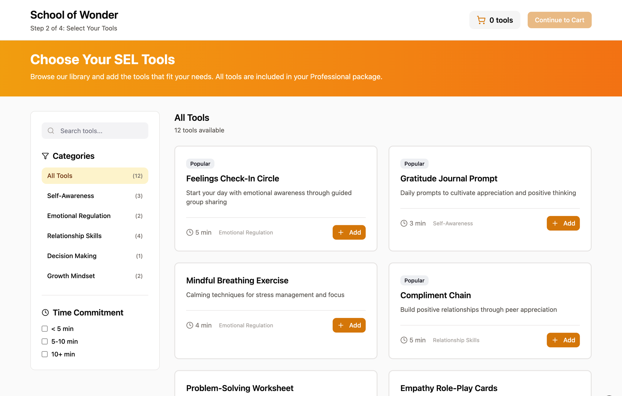
Browsing the curriculum tools—helping users quickly understand what each tool does and how it could fit into their classroom
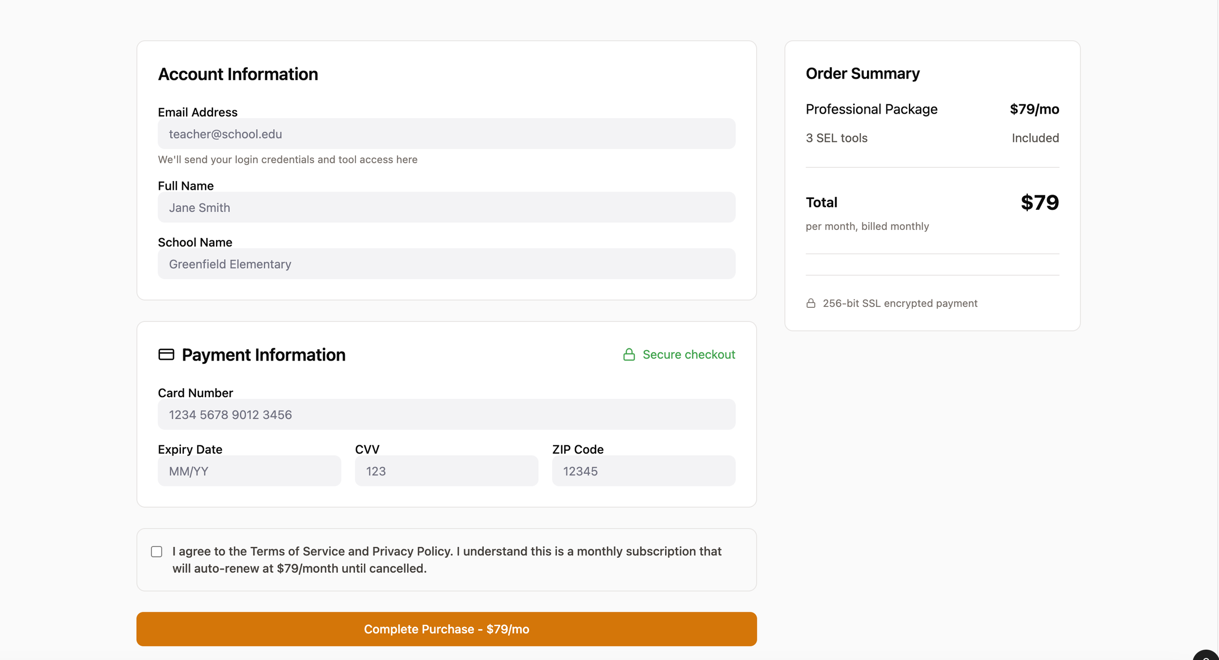
Checkout—reinforcing value, clarity and confidence in the purchase decision
Usability Testing & Iteration
We conducted usability testing with six educators—four traditional classroom teachers and two alternative education teachers—to evaluate the user journey. We learned that:
Users needed a way to filter curriculum tools by specific social-emotional learning topics.
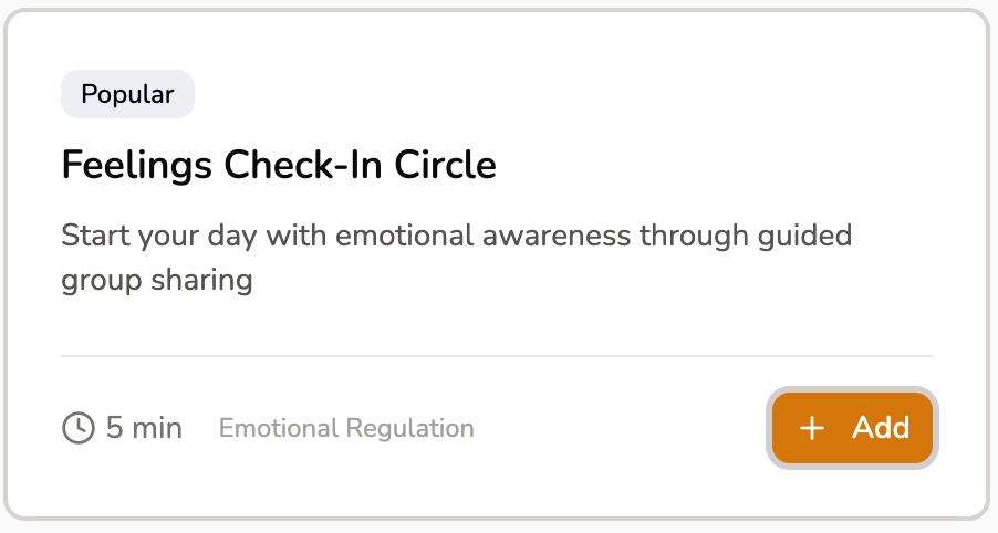
Users wanted visibility into the estimated time required to implement each tool.
Users wanted confirmation at checkout showing a clear summary of the tools they selected.
Users preferred a yearly subscription model aligned with the school calendar, rather than a monthly subscription, to better match budgeting cycles and classroom planning timelines.
On the positive side, teachers loved the modular structure, especially the wide variety of activities they could pick and choose from in the “menu” of options.
Before & After: These are the major changes that were made after usability testing.
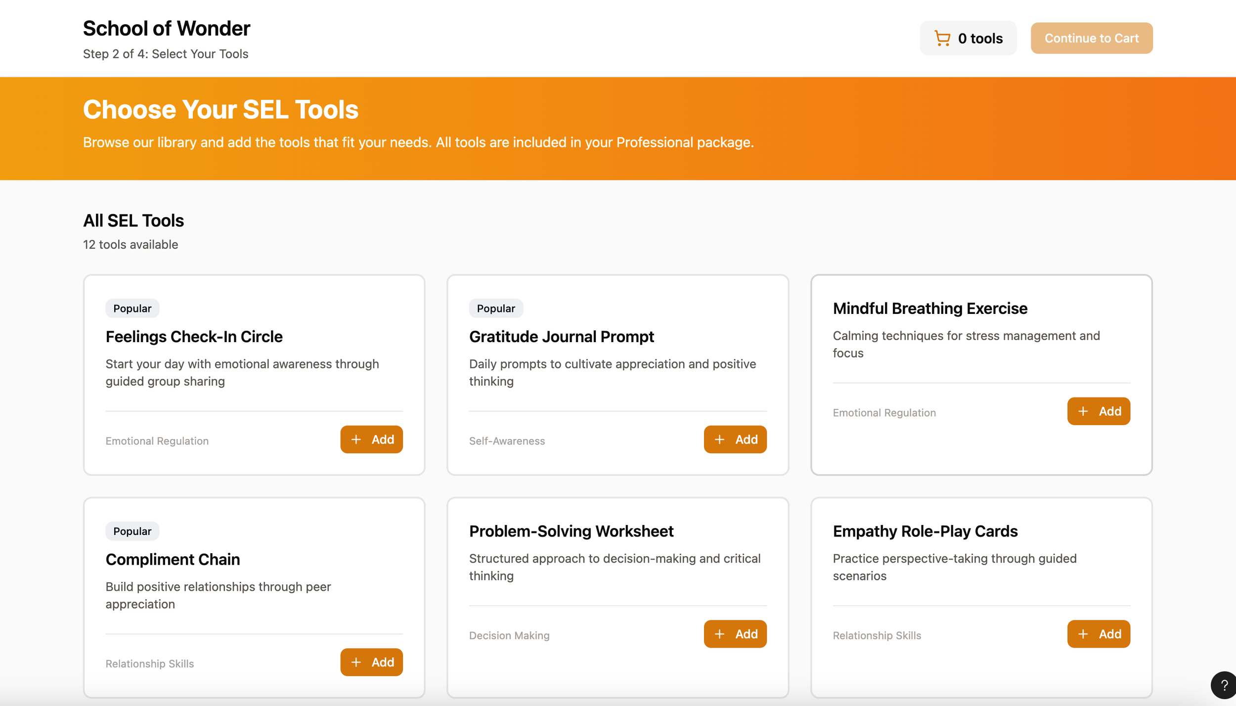
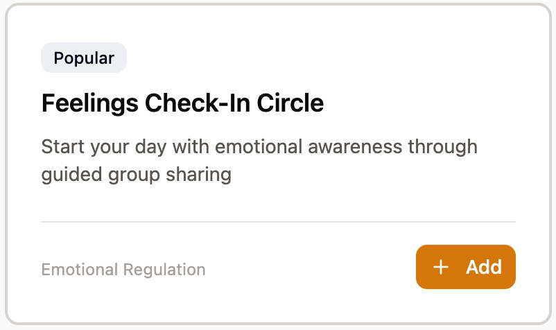
Introduced a search bar and left-aligned filter menu that allows users to efficiently browse and narrow tools based on their needs.
Added estimated completion times to each tool to help users gauge feasibility at a glance.
Displayed a persistent list of selected tools beneath the total price to help users review their selections throughout the checkout process.

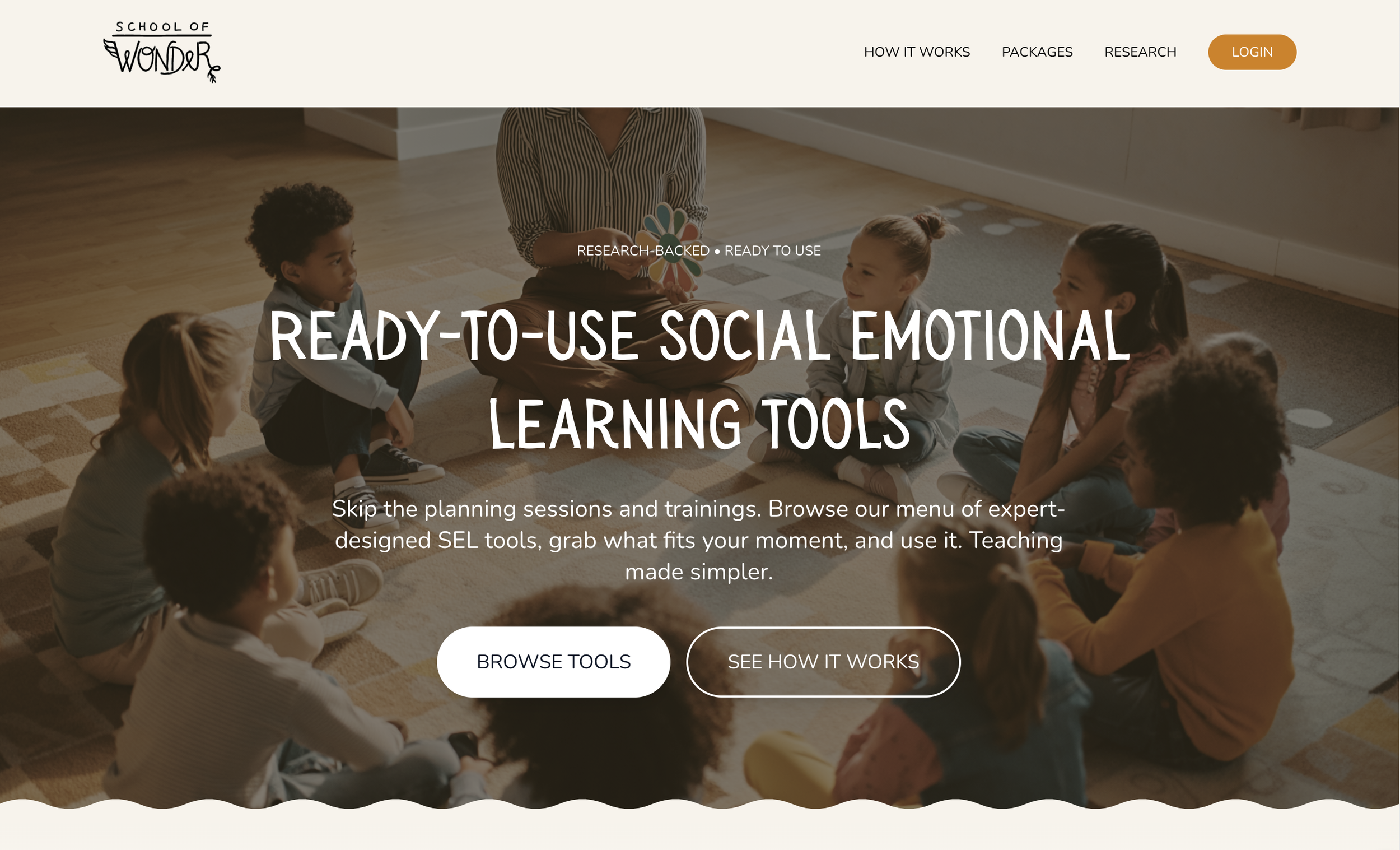
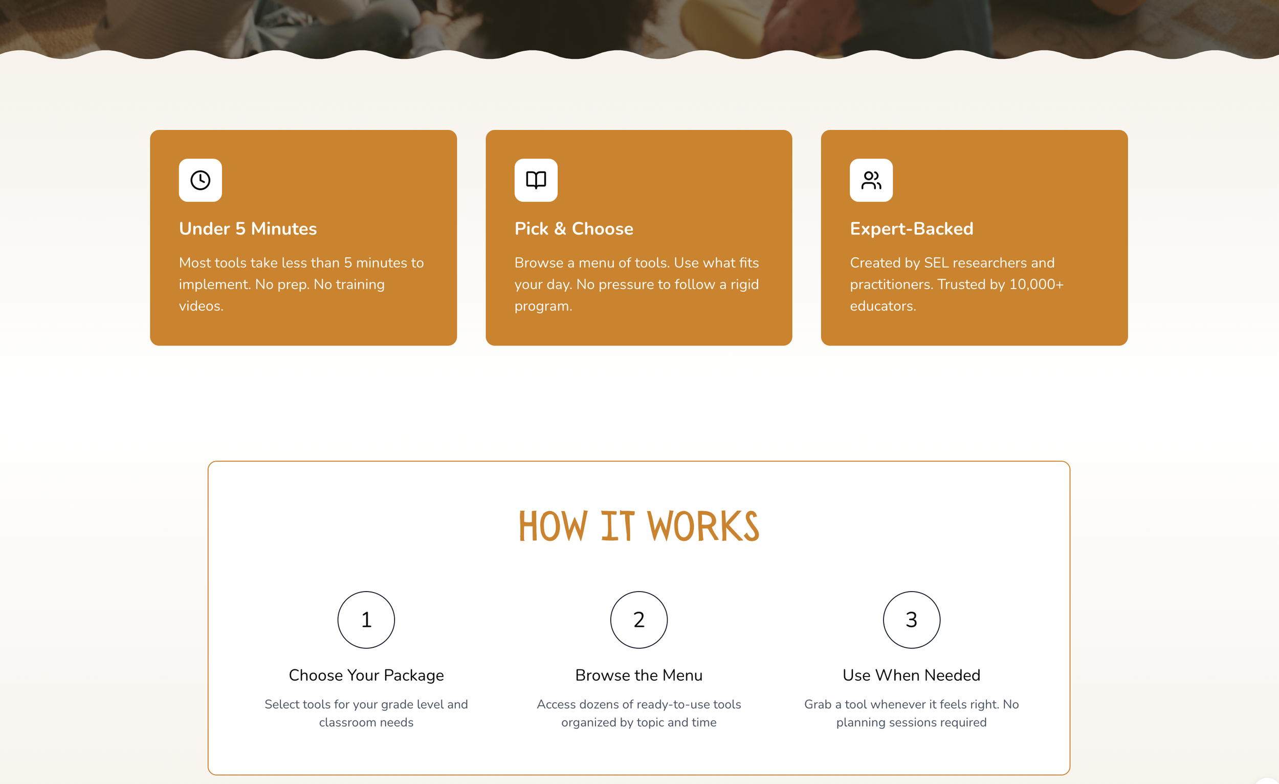
Here are some design decisions that influenced the homepage.
Dual CTAs ("Browse Tools" + "See How It Works") provide paths for different user readiness levels
The headline establishes a clear value proposition that addresses user needs while supporting the business objective.
Each of the orange cards directly addresses a specific pain point (time, flexibility, quality)
“How it works” is simple—just 3 steps signals this isn't complicated and offers minimal friction in the user journey
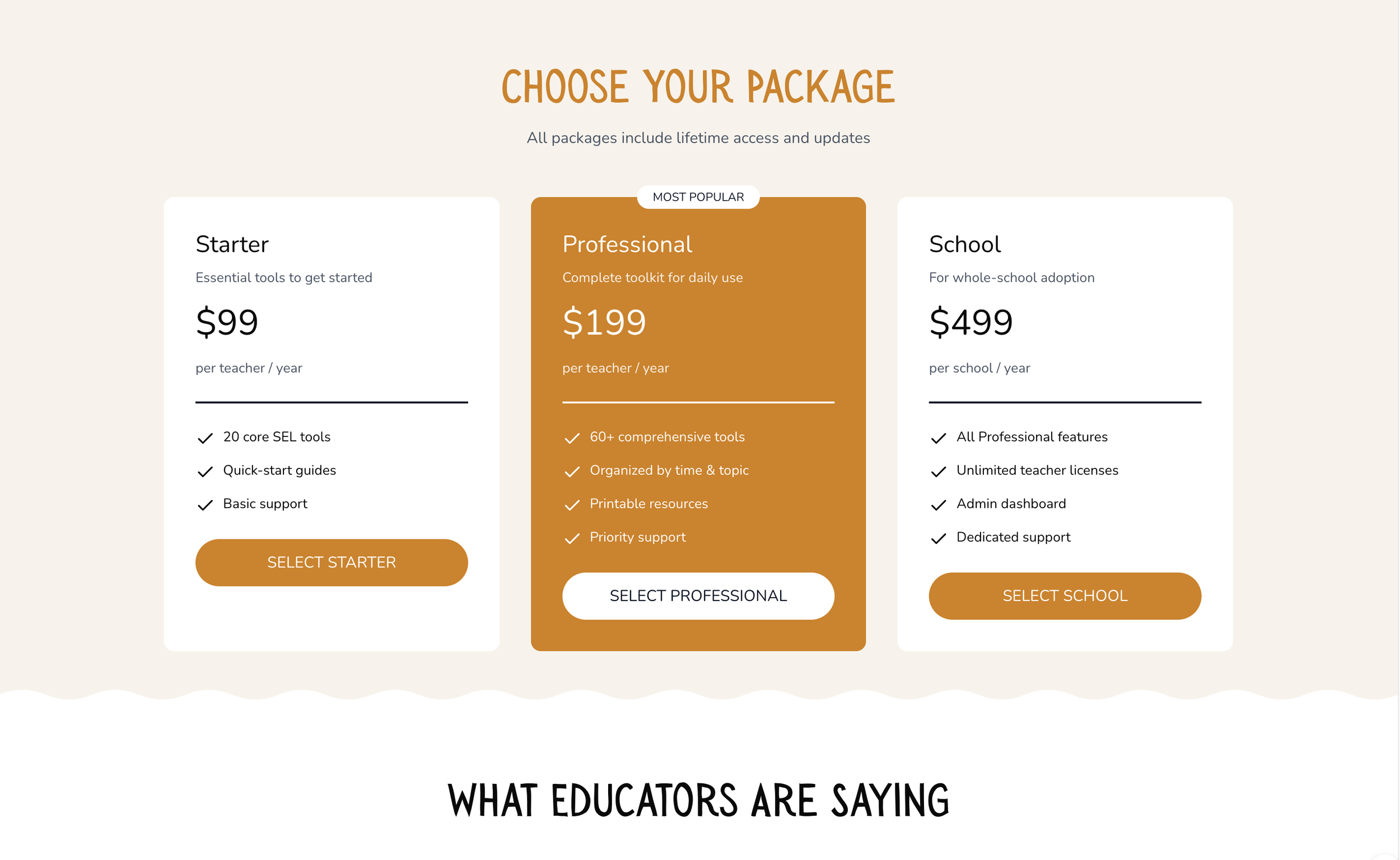
Building trust: Upfront pricing reduces skepticism and builds credibility
"Most Popular" badge gives a social proof nudge toward the Professional tier
Applied a tiered strategy to give users different entry points
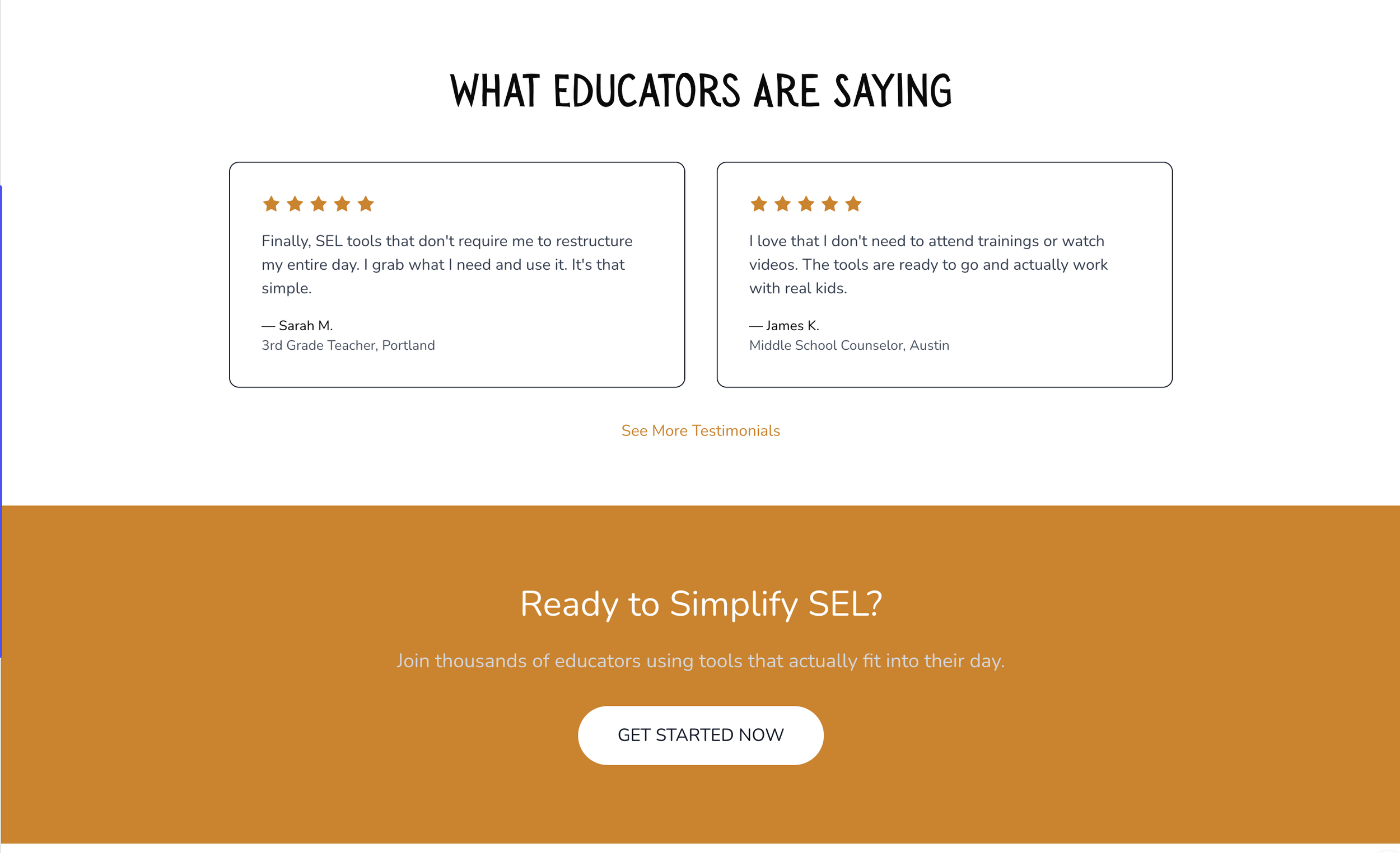
Shows only 2 social proofs initially, allowing expansion, to reduce visual overwhelm
Final CTA provides urgency without pressure. "Join thousands of educators" = social proof + FOMO
The Solution
Reframed the curriculum as ready-to-use, modular social-emotional learning tools, requiring minimal planning.
Created a transparent user journey, including a clear “how it works” section to build trust.
Designed a “choose your package” section with starter, professional, and school-wide options, each with transparent pricing.
The copy emphasized minimal prep, expert creation, and trust-building testimonials.

Impact & Outcomes
While we hadn’t launched fully, we did some pilot sessions in real classrooms with volunteer teachers.
Teachers really appreciated the large menu of options we brought to the table,
They loved that they didn’t have to go through any training,
They noted how little preparation it required.
This early feedback showed we were on the right track.
Moreover, usability testing and qualitative feedback revealed meaningful indicators of success across both user and business goals.
Teachers reported greater confidence in understanding the product when curriculum tools were clearly labeled as modular and supported by concrete visuals.
Reframing the offering from a “full curriculum” to “curriculum tools” reduced perceived adoption risk and made teachers more likely to imagine using the product in their own classrooms.
Iterations to the hero section and added product imagery improved users’ ability to quickly grasp what the tools did and how they could be applied in practice.
From a business perspective, these changes were expected to:
Increase conversion by lowering cognitive load at the point of decision-making
Improve long-term adoption by aligning the product with real classroom constraints
Strengthen trust with both teachers and school decision-makers by clearly communicating rigor and impact


